Example review · R01
Ananya Rao
- Review dimension
- Aesthetic direction
- Exact element and location
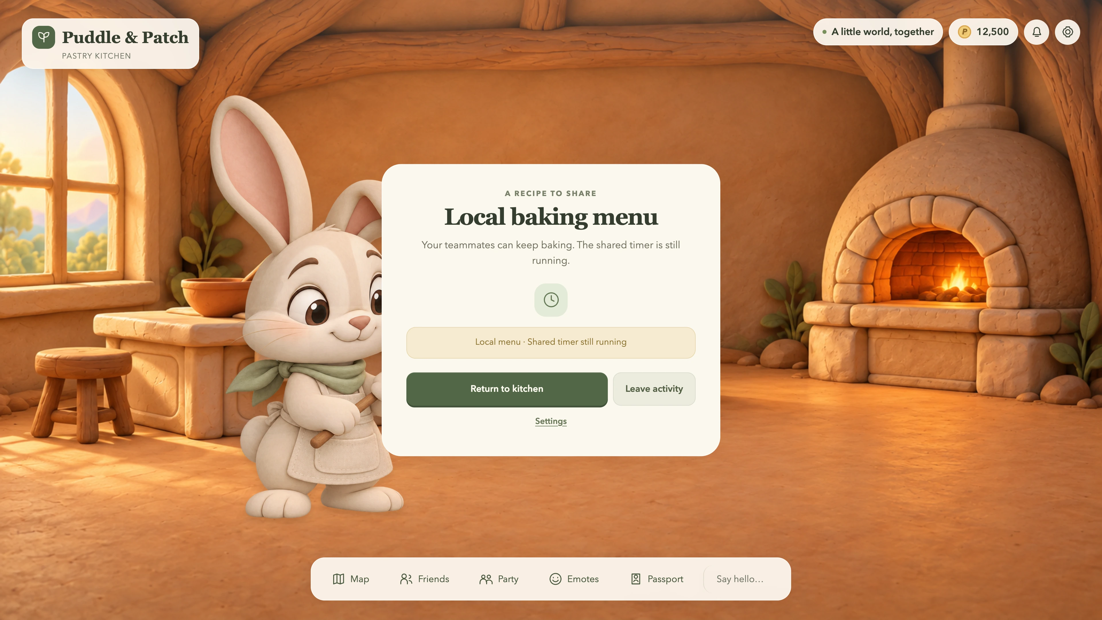
- Kitchen menu panel and action buttons
- Visible evidence
- In the kitchen menu, the bunny and environment have textured surfaces while the cream panel and sage actions remain flat. The heading and thin dock icons add further visual treatments. The result has a shared palette but not one material identity.
- Design judgement
- Make the menu belong to the bunny world
- Why it matters
- This affects aesthetic direction and how clearly the next game action is understood.
- Suggested direction
- Carry broad matte surfaces, softened edges and consistent lighting into the panel, action buttons and icons. Preserve the darker return action so the material revision does not flatten the hierarchy.
- Verification needed
- Compare the revised menu with the original at the same size and content. Review material coherence separately from label readability.
- Decision
- Revise
- Evidence basis
- Visible evidence against the brief